I decided to re-blog this post from about a year ago. I love this post, and I didn't want to lose it even if I was deleting my previous blog. Enjoy!
_____________________________________________________________________________________________________________________
from: January 2011
So my current living room leaves much to be desired... Granite, I am still in college, but hey a girl can dream right? Right now I have been in love with grays and yellows. I dunno what it is but I just can't get my mind off of that color combination. Unfortunately I am not taking a design studio course this semester, so I don't really have that outlet to create and design. Therefore I hope to do a lot of conceptual planning and designing (that hopefully I can include into my design portfolio).

So back to the gray and yellow and my dream room. The wall art to my left is from Modern Dose and I just love it. I think it would look great along side this couch from CB2 and also this great chair with ottoman from Design Within Reach which is always a mainstay when I go looking for furniture. I love to pick pieces that are neutral so that if you're not IN LOVE with the same accent color you chose to begin with, then you can easily go out and buy a few throw pillows and other accessories to give your space a different look. This way you don't limit yourself with the furniture you decide to purchase.
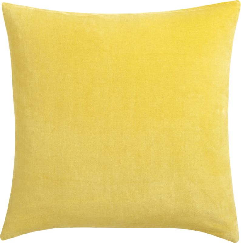
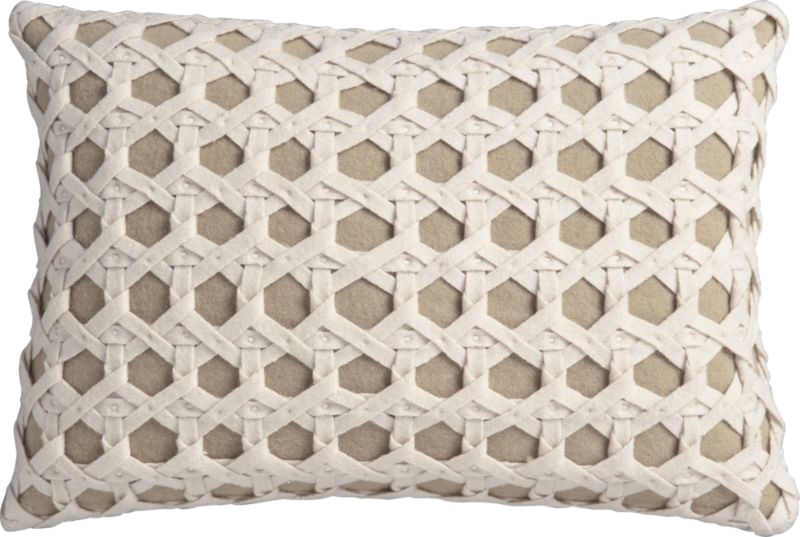
Now for the fun part, finding the perfect accessories for my "yellow look". I found these great throw pillows at CB2 as well. The difference in textures of the pillows are great. It gives the eye a bit to play with, instead of using all flat colored pillows. I also enjoy bringing in hints of natural colors that you would see, for example, in some floral arrangements that you may have throughout the year. I'm all for doing onochromatic schemes, but using splashes of complimentary colors really livens up the space. Now for a great rug to tie together the sofa and the two mid century modern chairs. I found this great one at CB2. It's a fun pattern that brings everything together.
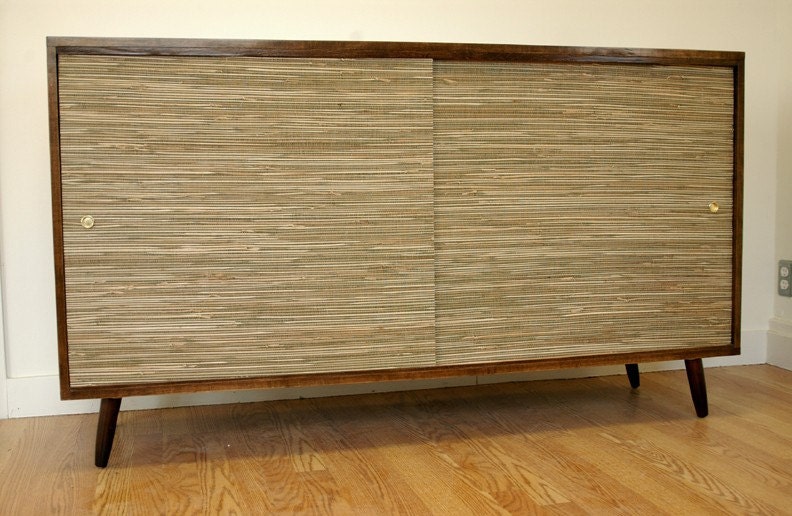
Now for some side tables, a coffee table, and a sofa table to display all of your personal items and decorations. One thing I love to do is use a buffet or credenza as a sofa table. It gives you a little bit more depth (so more storage inside) and allows for more trinkets and displays on top. I found this gorgeous one on Lunar Lounge Design's Etsy Shop. Using vintage pieces intermixed with new pieces is a great way to play with different styles. Next I found these side tables from Hudson Furniture Inc. which are reclaimed wood logs. These gorgeous raw wood pieces really make the room feel warm and inviting. For the coffee table I would like to bring another wood element, but something a bit more contemporary.

When I pick paint, I usually go with one of two brands, Benjamin Moore or Pittsburgh Paints. Being an interior design student I tend to be a bit more conscious and sensitive to the fact that we should be using green products. That's why in a lot of my designs I use re-purposed furniture and elements that can or have been recycled. So, most paint companies have green paint lines, but I just really like all of the research and background information those two companies provide. For the main paint color on the walls I chose to use Benjamin Moore (which I recommend you use Natura® Zero-VOC Paint) color Chantilly Lace for your trim, color Ice Cube Silver for your walls, and color Concord Ivory for your ceiling. I really like using a neutral color on the walls, and then adding a pop of color on the ceilings. It's unexpected, because most homeowners don't think to paint their ceilings a different color other than white, but it's just another "wall" for you to use color on so use it! Benjamin Moore's website has great tools and ideas to get you inspired for your own home.

Now for some flooring, which I have chose to use natural cork flooring. Cork is a great product because it is rapidly renewable, has great acoustical properties, and is water impermeable. It has the look of a hard surface floor, but has a softer feel. I love using this product just about anywhere I possibly can, and it really is very versatile. I found this product at Duro-Desgin.com which has many colors to choose from, but I really like the natural look of the cork.

Moving on we get to the curtains, which I found at Anthropology. I love this bold pattern in yellow on white. Simple yet striking pattern to bounce off the gorgeous light gray wall color. The tree pattern ties in all of the natural and wood elements I have brought into the room. I just love these curtains!
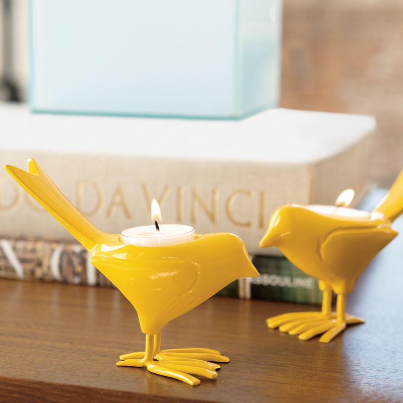
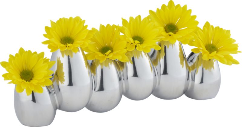
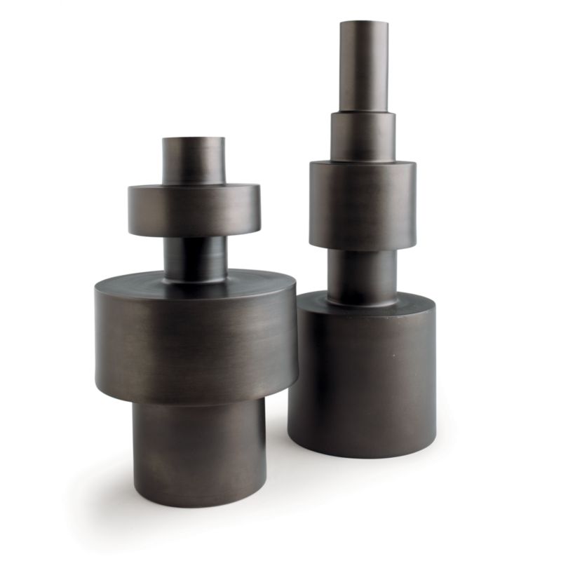
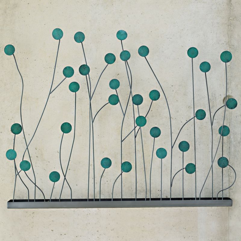 And finally we have some cute and fun accessories. The yellow bird candle holder, white lotus candle holder, teal blue and metal wall art, black vases, yellow rubber box vase, and silver connected vase are all from CB2. These pieces are all different in their lines, which creates interest in each piece. Although the pieces vary in style and shapes they really reinforce the color pallet and bring the space together as a whole. I really like how the teal blue wall art piece makes some of the yellow aspects really pop. The vases from CB2 are really fun and different. The black vases bring a lot of different size variations in and of themselves. The yellow vase is fun, and brings in more straight lines that we have in our furniture. Lastly we have our connected silver vases. I love these types of vases, because it really makes each flower a focal point. This piece would be great on that mid century sofa table.
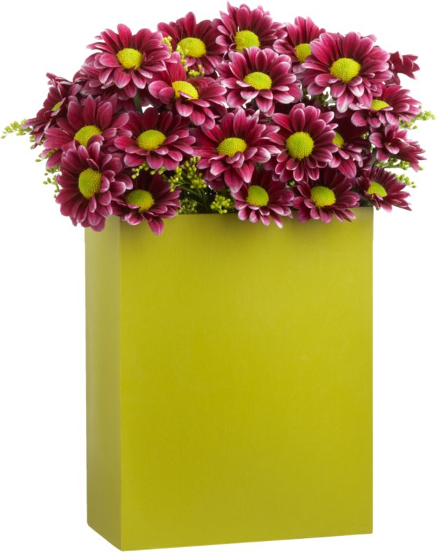
I found some other great accessories at one of my favorite websites, Etsy. If I were to say that I was obsessed with this site, that would be an understatement! I love that all of the items on there are either
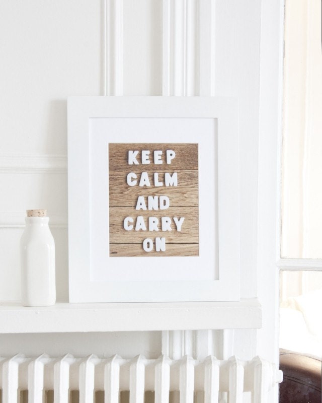
handmade, vintage, or supplies that you would need to create your own creations. So from Magalerie's Etsy Shop I found this great
"Keep Calm Carry On" wall art. This british "anti-scare" message from WWII has become a pop art phenomena in recent years, and I love Magalerie's take on it with the white frame and the white letters on a wood background. I also found this group of paper cut map art from StudioKMO's Etsy Shop that I just adore. It's so simple, but so
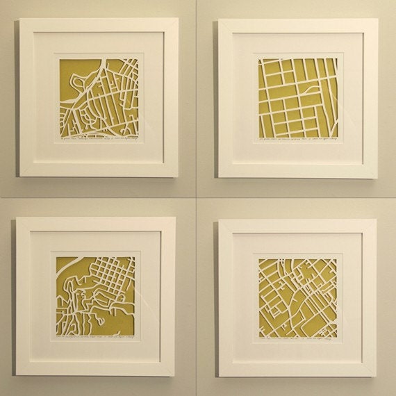

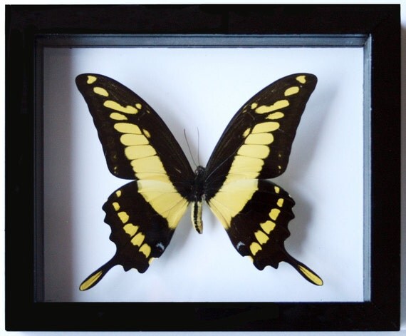
striking as a group of four. This fine art photograph from Amelia Kay Photography's Etsy Shop to the right, and also to the left from Marca La Grenouille's Etsy Shop. These two pieces tie into our color scheme, and also bring in that natural element that we have ongoing in the room. Floral photography is always nice to have as wall art. The next two photos are from Pretty Petal Studio's Etsy Shop on the right, and Ben the Butterfly Guy's Etsy Shop on the left. Just gorgeous stuff!

 And now for a few more final touches that I found from West Elm. A Dandelion Pillow Cover, Yellow Dotted Pillow Cover, Pure White Ceramic Vases, Honey Comb Inspired Vase, and a Picture Frame Ledge. These pieces are simple and stunning when bought together. I love how everything has a natural feel to it, which is a huge part of how I design. I want to respect nature and bring it indoors.

 If I were to design my own living room this would have to be a very close match to what I would actually buy. I love how the modern lines in the furniture play off of the more whimsical and natural elements I chose for the accessories.
_____________________________________________________________________________________________________________________
So I plan on doing another 'actual' new post later today, but I wanted to get this posted so I can delete my previous blog site. No promises, but I will try!
Best,
Megan
No comments:
Post a Comment